Lift Charts
The lift curve is a popular technique in direct marketing. One useful way to think of a lift curve is to consider a data mining model that attempts to identify the likely responders to a mailing by assigning each case a “probability of responding" score. The lift curve helps us determine how effectively we can “skim the cream" by selecting a relatively small number of cases and getting a relatively large portion of the responders.
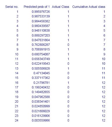
The input required to construct a lift curve is a validation dataset that has been “scored" by appending to each case the estimated probability that it will belong to a given class.
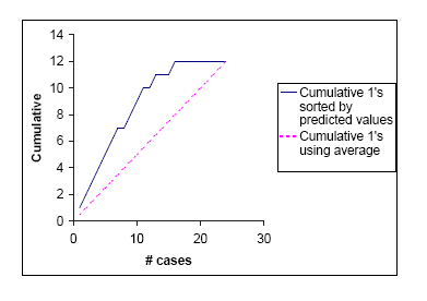
It is convenient to look at the cumulative lift chart (sometimes called a gains chart) which summarizes all the information in these multiple classification matrices into a graph. The graph is constructed with the cumulative number of cases (in descending order of probability) on the x-axis and the cumulative number of true positives on the y-axis as shown below. True positives are those observations from the important class (here class 1) that are classified correctly. The figure gives the table of cumulative values of the class 1 classifications and the corresponding lift chart.
The dashed line joining the points (0,0) to (24,12) is a reference line. For any given number of cases (the x-axis value), it represents the expected number of positives we would predict if we did not have a model but simply selected cases at random. It provides a benchmark against which we can see performance of the model.
If we had to choose 10 cases as class 1 (the important class) members and used our model to pick the ones most likely to be 1's, the lift curve tells us that we would be right about 9 of them. If we simply select 10 cases at random we expect to be right for 10 X 12/24 = 5 cases. The model gives us a “lift" in predicting class 1 of 9/5 = 1.8.
The lift will vary with the number of cases we choose to act on. A good classifier will give us a high lift when we act on only a few cases (i.e. use the prediction for the ones at the top). As we include more cases the lift will decrease. The lift curve for the best possible classifier - a classifier that makes no errors - would overlap the existing curve at the start, continue with a slope of 1 until it reached 12 successes (all the successes), then continue horizontally to the right.
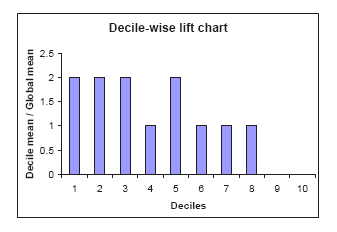
The same information can be portrayed as a “decile" chart, shown in the second figure below, which is widely used in direct marketing predictive modeling. The bars show the factor by which our model outperforms a random assignment of 0's and 1's. Reading the first bar on the left, we see that taking the 10% of the records that are ranked by the model as "the most probable 1's" yields twice as many 1's as would a random selection of 10% of the records.
Lift Chart
Decile Chart