Story Name: US Temperatures
Story
Datafile Name: US Temperatures
Abstract: The data gives the normal average January minimum temperature in degrees Fahrenheit with the latitude and longitude of 56 U.S. cities. (For each year from 1931 to 1960, the daily minimum temperatures in January were added together and divided by 31. Then, the averages for each year were averaged over the 30 years.)
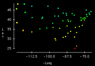
In the first graphic longitude was plotted as a negative value since it is measured in degrees west of the prime meridian. This allows the plot of Lat vs. -Long to resemble a map of the U.S. The colors correspond to the value of JanTemp at each of the cities, blue for cold temperatures and red for hot temperatures. The spectrum from blue to red represents the entire range of temperature values from the coldest to the hottest in these data.
The plot shows that there is a strong association between latitude and temperature except for the coasts where the ocean has a moderating effect on the temperature.
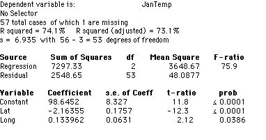
The second graphic is the table of a regression of JanTemp on Lat and Long. The output shows that both latitude and longitude are significant predictors of JanTemp. The third graphic is a partial regression plot of Lat. It shows that the relationship between JanTemp and Lat, after removing the effects of Long, is linear and negative. However, the fourth plot, a partial regression plot of Long, shows that the relationship between JanTemp and Long, after removing the effects of Lat, is not linear. The pattern of observations in the plot shows that Long has a curvilinear relationship with JanTemp as depicted by the curved line, which is Lowess smooth of the plotted variables. The regression model assumes that the relationship between JanTemp and Long is linear as depicted by the straight line in the plot. This plot shows that this assumption is clearly violated. Thus, the regression model in graph 2 is inadequate.
Peixoto (1990) reports a study in which a linear relationship is assumed between JanTemp and Lat; then, after removing the effects of Lat, a cubic polynomial in Long is used to predict JanTemp.