Contents
% AME20213:  Measurements and Data Analysis
% Spring 2013
% Sample MatLab Scripts

% Comments are preceded by percent signs
Cells can be denoted by double percent signs, this allows you to run specific cells of your script at a time
Use another pair of percent signs to indicate a new cell
Common useful commands:
%   clear all

% This command clears all variables in memory.  It may be a good idea to
% start your script with this to prevent old values assigned to your
% variables from corrupting your calcuations.

%   close all

% This command closes all extra windows (for figures, etc.)

%   clc

% This command clears all text in the output window without wiping values
% assigned to variables
Pre-allocating memory
% Although MatLab can handle dynamic arrays, the runtime of your script can
% be shortened significantly by pre-allocating memory for arrays that grow
% inside loops.  Common useful functions:

%   linspace(x1, x2, n)

% creates a row array consisting of n elements with values ranging from x1
% to x2, evenly spaced.  Example:  if you need a column array with values
% from 1 to 10 inclusive, you can do this using linspace...

columnvector = linspace(1, 10, 11)';

% the prime symbol tells matlab to transpose the vector from a row array to
% a column array.

%   zeros(m, n)

% zeros creates a matrix of m rows and n columns with all elements
% instantiated to the value 0.  Calling the zeros function with one
% argument creates a square matrix instead.

%   ones(m, n)

% creates a matrix of m rows and n columns with all elements instantiated
% to the value of 1.  Passing one argument results in a square matrix
% instead.

%   eye(m, n)

% creates a matrix of m rows and n columns with the value of 1 down the
% main diagonal and value of 0 for all other elements.  Passing one
% argument results in the identity matrix of the given dimension.
Structures
% Structures can be used to group several different data-types together.
% Fields in structures are referenced using periods.  Example:

% suppose you have several experimental runs, each with temperature data
% and position data in x, y, and z --> You could create a structure for
% each run to organize your data.

%   run1.temperature = data to be assigned
%   run1.xposition = data to be assigned
%   run1.yposition = data to be assigned
%   run1.zposition = data to be assigned

%   run2.temperatere = etc...

% structures can be passed as a single argument into function calls, and
% all fields in the function can be referenced as long as the argument
% passed contains said field.

% structures can also hold other structures:

%   run1.temperature = temperature data
%   run1.position.x = xdata
%   run1.position.y = ydata
%   run1.position.z = zdata

% so run1.position can be referenced and passed as its own structure in
% this case
Cell Arrays
% cell arrays are similar to arrays, except each element can hold
% mismatched data types (structures, ragged arrays, etc).  For example, the
% first element in a cell array may hold a 2 by 3 matrix, and the next
% element of the same cell array may hold a 5 by 1 column vector. Unlike
% arrays, cell array elements are referenced using curly brackets instead
% of parentheses --> { }

%   cell(m, n)

% creates an empty cell array of dimensions m by n
Plots and Figures
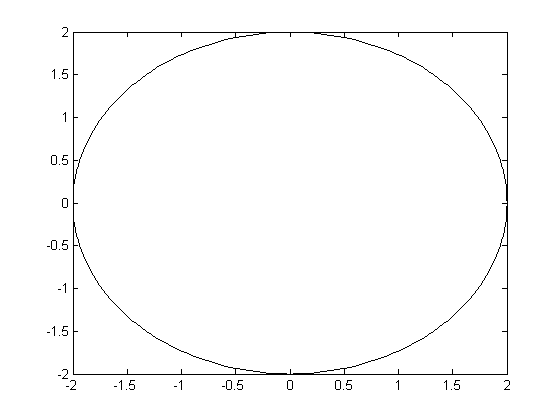
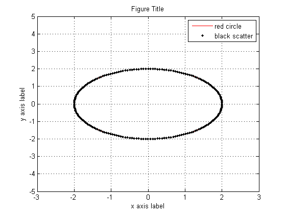
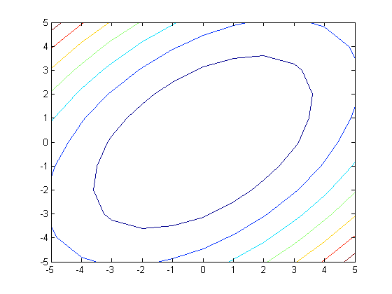
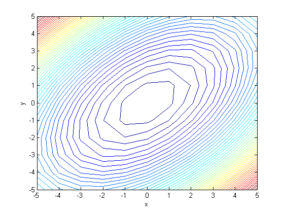
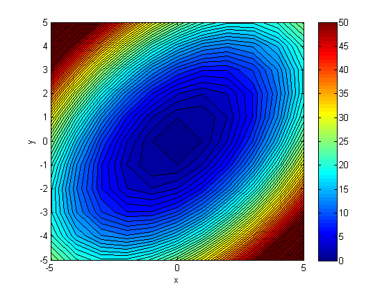
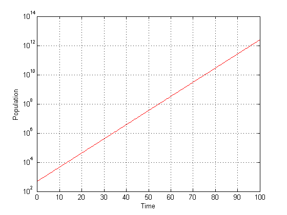
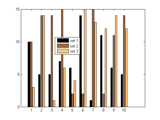
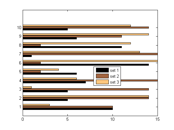
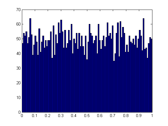
% 2-D Plots and Figures

%   plot

% plot is used to plot data on cartesian axes; if you have polar, etc.
% coordinates, you may want to convert the coordinates to the respective
% cartesian pairs.

% Example: Making and Plotting a Circle

radius = 2;
theta = linspace(0, 2 * pi, 201);
x = radius * cos(theta);
y = radius * sin(theta);

figure(1)
plot(x, y, 'k-');

% Custimizations to your plots can be made:
% the commands above will plot a black circle, should you want a different
% plotting style, change the third argument of the plot (the literal
% string)

% 'k-' -->  the k tells MatLab that the plot color is black and the - tells
% MatLab to connect each point with a solid line

% alternative styles (for a complete list, refer to the help plot documentation of MatLab:
% r --> red; g --> green; b --> blue; y --> yellow; c --> cyan; m --> magenta;
% . --> scatter plots; o --> scatter plots circles; -- --> connect points
% dashed lines; x --> scatter plot X

% so: plot(x, y, 'bo--') would result in a plot with blue dashed line
% connections and blue circles at each data point

% To put multiple plots on a figure, use the command hold on after the
% figure command

figure(2)
plot(x, y, 'r-');
hold on
plot(x, y, 'k.');

% This will result in a figure with a red circle with black scatter plots
% for each data point

% Figures can be labeled:

xlabel('x axis label');
ylabel('y axis label');
legend('red circle','black scatter','location','NorthEast');
title('Figure Title');
axis([-3, 3, -5, 5]);
grid on

% for the legend, the list of strings passed labels each plot added to the
% figure in the order they were plotted.  The string 'location' tells
% MatLab that the next string passed indicates where the legend should be
% positioned in the figure: 'North', 'NorthEast', 'East', 'SouthEast', 'South',
% 'SouthWest', 'West', 'NorthWest', 'North', and 'Best'.  'Best' lets
% MatLab decide where to place the legend to optimize visibility of plots.

% the axis function allows you to adjust the x and y range of the plots; it
% takes a 4 element array indicating the xmin, xmax, ymin, and ymax values
% in that order.

% grid on shows the grid for the scaling

%   contour

% creates level contours for a matrix of values.

% Example:

xpos = linspace(-5, 5, 11);
ypos = fliplr(linspace(-5, 5, 11)); % fliplr(matrix) reverses the order of columns of the passed matrix
field = zeros(length(ypos), length(xpos));

for m = 1:length(ypos)
    for n = 1:length(xpos)
        field(m,n) = xpos(n)^2 + ypos(m)^2 - xpos(n) * ypos(m);
    end
end

figure(3)
contour(xpos, ypos, field);


figure(4)
contour(xpos, ypos, field, 50);
xlabel('x');
ylabel('y');

% Figure 4 demonstrates adjustments in the number of contours to plot.

%   contourf

% contour f is similar to contour, except MatLab will fill in the white
% space with colors corresponding to the contour level.

figure(5)
contourf(xpos, ypos, field, 75);
colorbar
xlabel('x');
ylabel('y');
colormap('default');
caxis([0 50]);

% colorbar tells MatLab to display the color scale
% colormap sets the color scheme used in the figure; there are many preset
% colormaps
% ('jet','HSV','Hot','Cool','Spring','Summer','Autumn','Winter','Gray','Bone','Copper','Pink','Lines')
% or you can define your own colormaps (see colormap documentation)
% caxis sets the min and max value of your colorscale; it takes a 2 element
% array corresponding to the low and high values respectively

%   loglog
%   semilogx
%   semilogy

% logarithmic scales use the three functions above.  loglog uses a log
% scale for both the x and y axes; semilogx uses a log scale on the x axis
% and a cartesian scale on the y axis; semilogy uses a cartesian scale on
% the x axis and a log scale on the y axis

% Example:

time = linspace(0, 100, 201);
population = 500 * 1.25 .^ time;

% the . in front of the exponentiation operator tells MatLab that the
% operator is not a matrix/vector operator --> instructs MatLab to apply the
% operator to each element individually

figure(6)

semilogy(time, population, 'r-');
xlabel('Time');
ylabel('Population');
grid on

%   bar

% creates vertical bar plots for a given matrix of data.  Each column in the matrix
% represents one data set, and each data set has one bar for each row in
% the matrix.  The strings passed into the legend function labels the data
% set in order of increasing column index

% Example:

dat = ceil(rand(10, 3) * 15);

figure(7)
bar(dat);
colormap('Copper');
legend('set 1','set 2','set 3','location','Best');

%   barh

% creates horizontal bars instead; otherwise, it's the same as bar

figure(8)
barh(dat);
colormap('Copper');
legend('set 1','set 2','set 3','location','Best');


%   hist

% creates a histogram of the data passed.

% Example:

sample = rand([5000, 1]);
figure(9);
hist(sample, 101);
Subplots
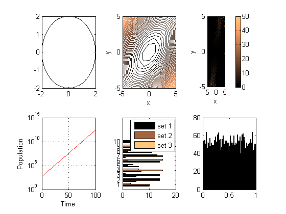
% MatLab can present multiple plots in a single figure.  This is done using
% subplots

%   subplot(m, n, i)

% called after the figure function; splits the figure into m rows by n column
% regions and focuses on region i.  Subplot indices go across the columns before
% going down the rows

figure(10)

subplot(2, 3, 1)
plot(x, y, 'k-');

subplot(2, 3, 2)
contour(xpos, ypos, field, 50);
xlabel('x');
ylabel('y');

subplot(2, 3, 3)
contourf(xpos, ypos, field, 75);
colorbar
xlabel('x');
ylabel('y');
colormap('default');
caxis([0 50]);

subplot(2, 3, 4)
semilogy(time, population, 'r-');
xlabel('Time');
ylabel('Population');
grid on

subplot(2, 3, 5)
barh(dat);
colormap('Copper');
legend('set 1','set 2','set 3','location','Best');

subplot(2, 3, 6)
hist(sample, 101);