Creating graphs of variables from data and objects created from statistical models is fundamental to gaining actionable knowledge. Graphics are especially important in communicating discovered relationships in data to non-statisticians in a concise form. They also play an important role in gaining insight from the data that can guide a choice of statistical model.
Base R contains functions that can be used to create scatter plots, boxplots, histograms, lines best approximating data, etc. It is robust and has served statisticians well. However, the structure of the commands may vary from one problem to the next, it is difficult to know what parameters to vary in order to, e.g., change the label of the x-axis, and it's nearly impossible to create complicated overlays. ggplot2 changes all of this.
First, we'll give some examples of standard R and ggplot2 handle some very basic plots and then dive into the structure of a ggplot graphic.
(These are reproduced from reference 2.)
Load ggplot2:
library(ggplot2)
Short of the full-blown ggplot, the ggplot2 library offers a function qplot that creates ggplot objects but uses a reduced format much like the plot function. We'll show this as well as full ggplot in the examples.
ggplot2 includes some simple data.frames we can use in examples.
str(mtcars)
## 'data.frame':    32 obs. of  11 variables:
##  $ mpg : num  21 21 22.8 21.4 18.7 18.1 14.3 24.4 22.8 19.2 ...
##  $ cyl : num  6 6 4 6 8 6 8 4 4 6 ...
##  $ disp: num  160 160 108 258 360 ...
##  $ hp  : num  110 110 93 110 175 105 245 62 95 123 ...
##  $ drat: num  3.9 3.9 3.85 3.08 3.15 2.76 3.21 3.69 3.92 3.92 ...
##  $ wt  : num  2.62 2.88 2.32 3.21 3.44 ...
##  $ qsec: num  16.5 17 18.6 19.4 17 ...
##  $ vs  : num  0 0 1 1 0 1 0 1 1 1 ...
##  $ am  : num  1 1 1 0 0 0 0 0 0 0 ...
##  $ gear: num  4 4 4 3 3 3 3 4 4 4 ...
##  $ carb: num  4 4 1 1 2 1 4 2 2 4 ...
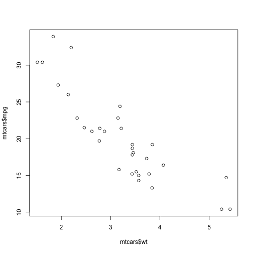
Do a scatter plot of weight versus MPG.
plot(mtcars$wt, mtcars$mpg)

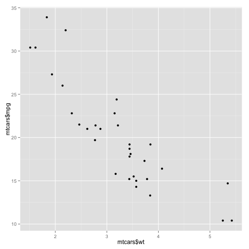
Now the qplot version.
qplot(mtcars$wt, mtcars$mpg)
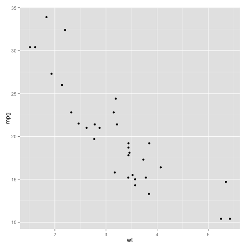
Alternate syntax declares the data.frame and just uses variable names from it.
qplot(wt, mpg, data = mtcars)

This plot is created in ggplot syntax with
ggplot(data = mtcars, aes(x = wt, y = mpg)) + geom_point()
str(pressure)
## 'data.frame':    19 obs. of  2 variables:
##  $ temperature: num  0 20 40 60 80 100 120 140 160 180 ...
##  $ pressure   : num  0.0002 0.0012 0.006 0.03 0.09 0.27 0.75 1.85 4.2 8.8 ...
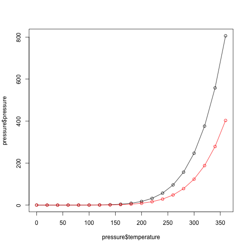
plot(pressure$temperature, pressure$pressure, type = "l")
# Add the points
points(pressure$temperature, pressure$pressure)
# Add similar plots for pressure/2 colored in red
lines(pressure$temperature, pressure$pressure/2, type = "l", col = "red")
points(pressure$temperature, pressure$pressure/2, col = "red")
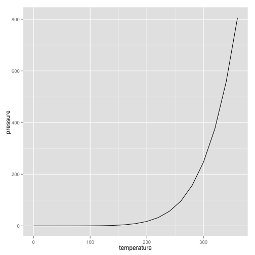
With qplot we can plot a line fit to the points by specifing the geom, short for geometry of what is plotted.
qplot(temperature, pressure, data = pressure, geom = "line")

# Equivalently:
ggplot(data = pressure, aes(x = temperature, y = pressure)) + geom_line()
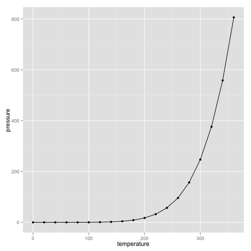
# Add points
qplot(temperature, pressure, data = pressure, geom = c("line", "point"))

ggplot(data = pressure, aes(x = temperature, y = pressure)) + geom_line() +
    geom_point()
A histogram is not a direct plot of data, but a summary of values in specified bins.
hist(mtcars$mpg)
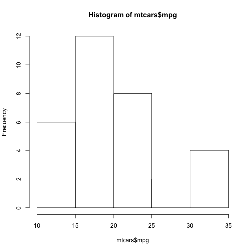
This grouped data in ranges of 5 and plotted the number of samples in that range. We can specify a range; i.e., bin width.
hist(mtcars$mpg, breaks = 10)
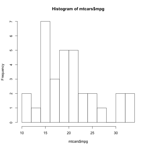
# Specifies the number of cuts to the data
Here's how ggplot does this:
ggplot(data = mtcars, aes(x = mpg)) + geom_histogram(binwidth = 4)
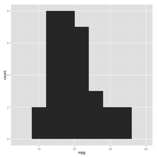
Here, the y variable was calculated. In ggplot this is known as a statistic associated with the plot.
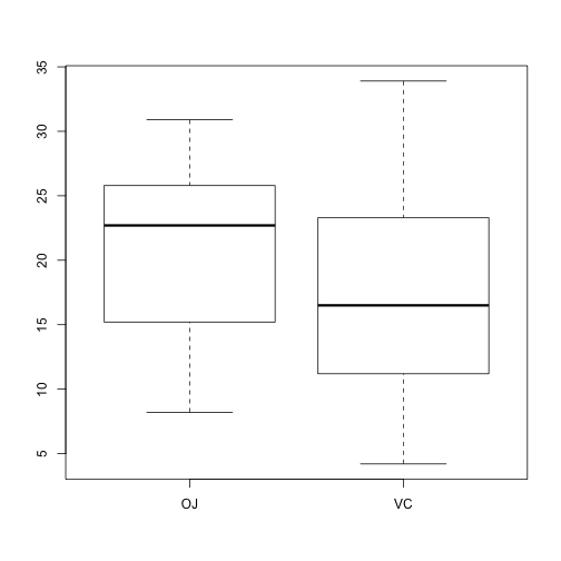
This is a plot a continuous variable versus a discrete one.
str(ToothGrowth)
## 'data.frame':    60 obs. of  3 variables:
##  $ len : num  4.2 11.5 7.3 5.8 6.4 10 11.2 11.2 5.2 7 ...
##  $ supp: Factor w/ 2 levels "OJ","VC": 2 2 2 2 2 2 2 2 2 2 ...
##  $ dose: num  0.5 0.5 0.5 0.5 0.5 0.5 0.5 0.5 0.5 0.5 ...
summary(ToothGrowth$dose)
##    Min. 1st Qu.  Median    Mean 3rd Qu.    Max.
##    0.50    0.50    1.00    1.17    2.00    2.00
table(ToothGrowth$dose)
##
## 0.5   1   2
##  20  20  20
Only 3 values to dose even though it's numeric.
# Here, x is a factor, declaring it to be discrete
plot(ToothGrowth$supp, ToothGrowth$len)
# In formula syntax this is
boxplot(len ~ supp, data = ToothGrowth)
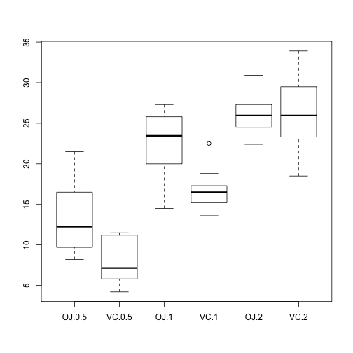
We can also include the interactions of variables in the formula syntax.
boxplot(len ~ supp + dose, data = ToothGrowth)
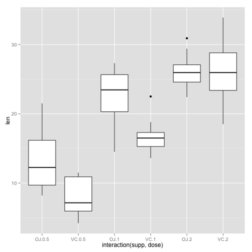
The latter is done in ggplot with
ggplot(data = ToothGrowth, aes(x = interaction(supp, dose), y = len)) + geom_boxplot()
ggplot was based on the Grammar of Graphics developed by Wilkinson, 2005. It puts an organized framework around the various parts of a graph.
The components of this grammar that we'll use in plotting are as follows.
Mandatory features
data is simply what it says. It's the source of what you'll plot. In ggplot2 this must be a data.frame
aesthetic mapping Here, an aesthetic is a visual feature that cna be used to represent properties of the variables, like x, y, color, shape, size, linetype, pointtype, etc. Variables in the data are mapped to aesthetics for plotting purposes.
geom = geometric object. This is what you actually see, be it line, points, polygons, bars, etc.
Optional or implicit features
stat is a statistical transformation of the data producing some quantity that is then mapped to an aesthetic.
scales map values in the data space to values in the aesthetic space (color, size, shape, ...). Scales are reported on the plot in a legend or axis labels.
coord is a coordinate system. This describes how x and y are layed out on the plane. Normally, cartesian coordinates are used.
facet A faceting specification describes how to break up the data into subsets and display those in subplots.
A very handy feature of ggplot is that it returns a ggplot object that can later to reused or added to.
tooth_box_plot <- ggplot(data = ToothGrowth, aes(x = interaction(supp, dose),
    y = len)) + geom_boxplot()
tooth_box_plot

class(tooth_box_plot)
## [1] "gg" "ggplot"
names(tooth_box_plot)
## [1] "data"        "layers"      "scales"      "mapping"     "theme"
## [6] "coordinates" "facet"       "plot_env"    "labels"
These objects can also be edited to change the coordinate labels, color scheme, etc.
ggplot objects are built up in layers, like plots in photoshop. The first
... + geom_whatever()
creates the first layer and geomtric objects. Others can be added later, like having points and lines both plotted.
Virtually everything you see in a ggplot graphic can be customized, from the axis labels, to the position and format of a legend, colors and sizes of geometric objects, etc. You can also add text to a graphic in a specified location, and combine panels created separately into larger figures. Customization can be done using label attributes for scales, and most importantly, using the theme command. Navigating all of these possibilities is tough. I'll illustrate some and show you how to find others.