We're going to get started really using ggplot2 with examples. Along the way, we'll introduce various aspects of fine tuning the output, as well as handling many different types of plotting problems.
The first theme we'll illustrate is how multiple aesthetics can add other dimensions of information to the plot.
Here, we illustrate various aesthetics, both discrete and continuous, using point plots. The geom in all of these will be point.
library(ggplot2)
str(mtcars)
## 'data.frame':    32 obs. of  11 variables:
##  $ mpg : num  21 21 22.8 21.4 18.7 18.1 14.3 24.4 22.8 19.2 ...
##  $ cyl : num  6 6 4 6 8 6 8 4 4 6 ...
##  $ disp: num  160 160 108 258 360 ...
##  $ hp  : num  110 110 93 110 175 105 245 62 95 123 ...
##  $ drat: num  3.9 3.9 3.85 3.08 3.15 2.76 3.21 3.69 3.92 3.92 ...
##  $ wt  : num  2.62 2.88 2.32 3.21 3.44 ...
##  $ qsec: num  16.5 17 18.6 19.4 17 ...
##  $ vs  : num  0 0 1 1 0 1 0 1 1 1 ...
##  $ am  : num  1 1 1 0 0 0 0 0 0 0 ...
##  $ gear: num  4 4 4 3 3 3 3 4 4 4 ...
##  $ carb: num  4 4 1 1 2 1 4 2 2 4 ...
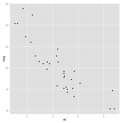
Plot MPG versus weight to begin with.
p <- ggplot(data = mtcars, aes(x = wt, mpg))
p + geom_point()

summary(mtcars$qsec)
##    Min. 1st Qu.  Median    Mean 3rd Qu.    Max.
##    14.5    16.9    17.7    17.8    18.9    22.9
This is a continuous variable. We can use a color scale to add this dimension to the plot.
p + geom_point(aes(color = qsec))
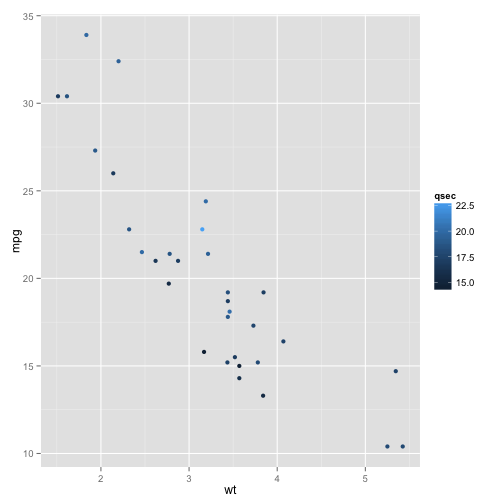
The legend describes the scale. This is a continuous scale.
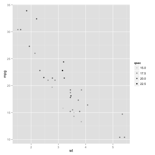
Another aesthetic is alpha that sets the opacity of the point. You use this for continuous variables.
p + geom_point(aes(alpha = qsec))
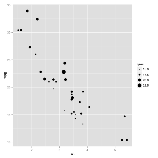
Size:
p + geom_point(aes(size = qsec))
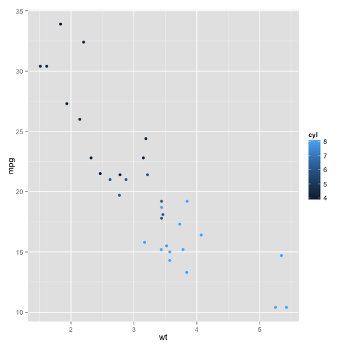
We can also add the number of cylinders to the plot.
p + geom_point(aes(color = cyl))
table(mtcars$cyl)
##
##  4  6  8
## 11  7 14
This isn't what we wanted. cyl is a discrete variable. To get ggplot to recognize it as such we need convert it to a factor.
p + geom_point(aes(color = factor(cyl)))
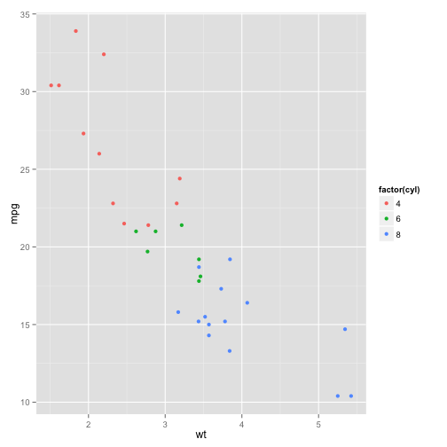
Later we'll change the label of the legend.
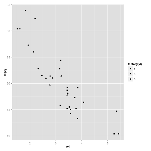
Another way to plot discrete variables is with shape.
p + geom_point(aes(shape = factor(cyl)))
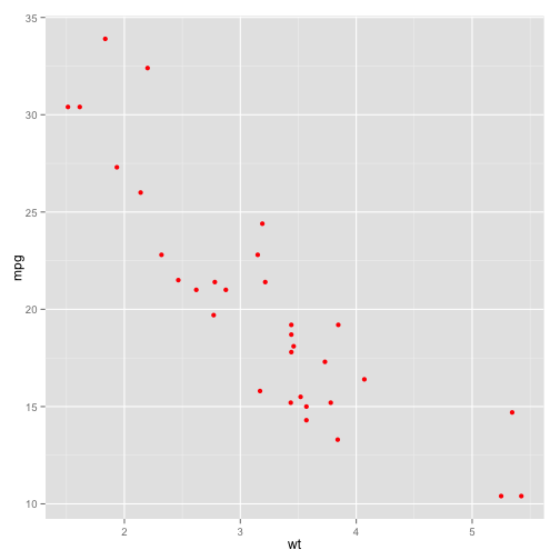
What if you want all points to be red? You use the color parameter to set it to a constant rather than a variable, without the aes
p + geom_point(color = "red")
For some datasets, changing the alpha value uniformly can improve the information content.
str(diamonds)
## 'data.frame':    53940 obs. of  10 variables:
##  $ carat  : num  0.23 0.21 0.23 0.29 0.31 0.24 0.24 0.26 0.22 0.23 ...
##  $ cut    : Ord.factor w/ 5 levels "Fair"<"Good"<..: 5 4 2 4 2 3 3 3 1 3 ...
##  $ color  : Ord.factor w/ 7 levels "D"<"E"<"F"<"G"<..: 2 2 2 6 7 7 6 5 2 5 ...
##  $ clarity: Ord.factor w/ 8 levels "I1"<"SI2"<"SI1"<..: 2 3 5 4 2 6 7 3 4 5 ...
##  $ depth  : num  61.5 59.8 56.9 62.4 63.3 62.8 62.3 61.9 65.1 59.4 ...
##  $ table  : num  55 61 65 58 58 57 57 55 61 61 ...
##  $ price  : int  326 326 327 334 335 336 336 337 337 338 ...
##  $ x      : num  3.95 3.89 4.05 4.2 4.34 3.94 3.95 4.07 3.87 4 ...
##  $ y      : num  3.98 3.84 4.07 4.23 4.35 3.96 3.98 4.11 3.78 4.05 ...
##  $ z      : num  2.43 2.31 2.31 2.63 2.75 2.48 2.47 2.53 2.49 2.39 ...
pd <- ggplot(data = diamonds, aes(carat, price))
pd + geom_point()
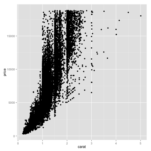
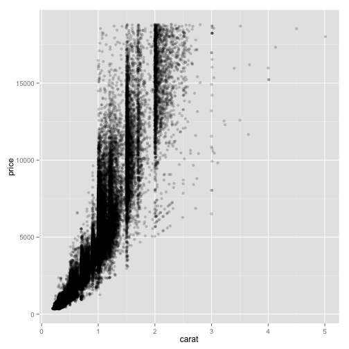
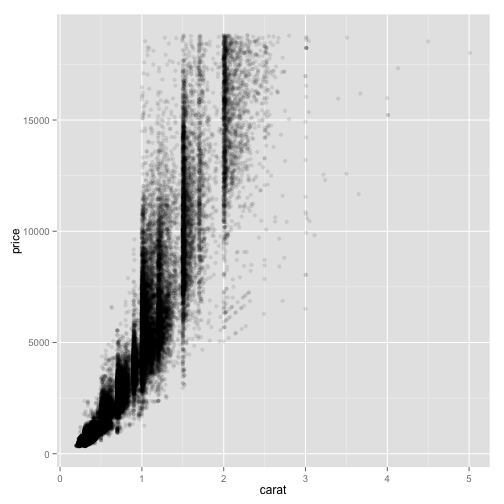
Over-plotting hides the number of points in each neighborhood. We can reduce this problem by making each point more transparent.
pd + geom_point(alpha = 0.2)
pd + geom_point(alpha = 0.1)
This is a little more than just learning the right commands. ggplot has geoms that are particularly well-suited for handling certain data and statistics, and gives options for creating layers that add lots more information than you may have thought possible.
I want to work with diamonds but it's too big. Lets select a random sample of 100 records.
set.seed(1523)  # This makes the result or sampling reproducible
dsmall <- diamonds[sample(nrow(diamonds), 100), ]
First plot the points.
pd0 <- ggplot(data = dsmall, aes(carat, price))
pd1 <- pd0 + geom_point()
pd1
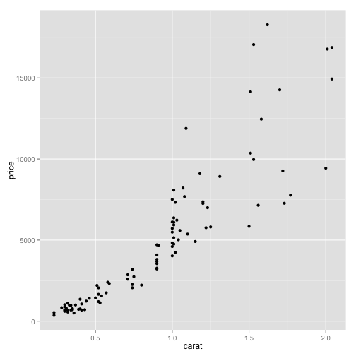
In discerning patterns it can be very helpful to fit a curve through the data. You are in effect smoothing the data into a differentiable curve, or even a straight line under regression.
# Add a layer of
pd2 <- pd1 + geom_smooth()
pd2
## geom_smooth: method="auto" and size of largest group is <1000, so using
## loess. Use 'method = x' to change the smoothing method.
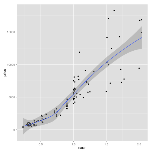
The default for geom_smooth is a loess fit. (Use ?loess to find more information.) The gray region is one standard error. You can suppress that with the option se=FALSE. The degree of smoothing can be controlled with the span option; 0 is very bumping and 1 very flat.
pd1 + geom_smooth(span = 0.1)
## geom_smooth: method="auto" and size of largest group is <1000, so using
## loess. Use 'method = x' to change the smoothing method.
## Warning: pseudoinverse used at 0.9
## Warning: neighborhood radius 0.1
## Warning: reciprocal condition number 1.6581e-16
## Warning: There are other near singularities as well. 0.0001
## Warning: pseudoinverse used at 0.9
## Warning: neighborhood radius 0.1
## Warning: reciprocal condition number 1.6581e-16
## Warning: There are other near singularities as well. 0.0001
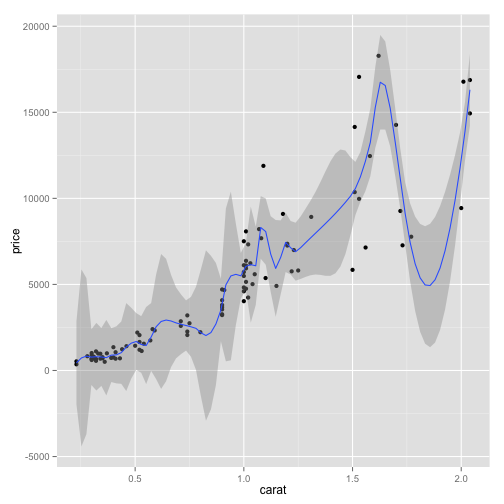
pd1 + geom_smooth(span = 0.9)
## geom_smooth: method="auto" and size of largest group is <1000, so using
## loess. Use 'method = x' to change the smoothing method.
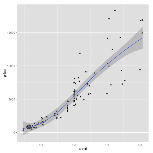
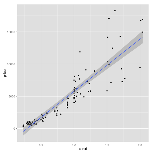
You can also fit and graph a regression line.
pd1 + geom_smooth(method = "lm")
# suppress the SE region
pd1 + geom_smooth(method = "lm", se = FALSE)
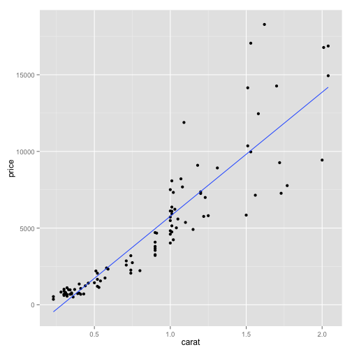
We see a strong linear relationship between price and carat It would be good to see if this linear relationship is effected by other characteristics, like color. Color is a factor in the data so it will be treated as discrete.
ppc <- ggplot(data = diamonds, aes(x = color, y = price/carat))
ppc + geom_point()
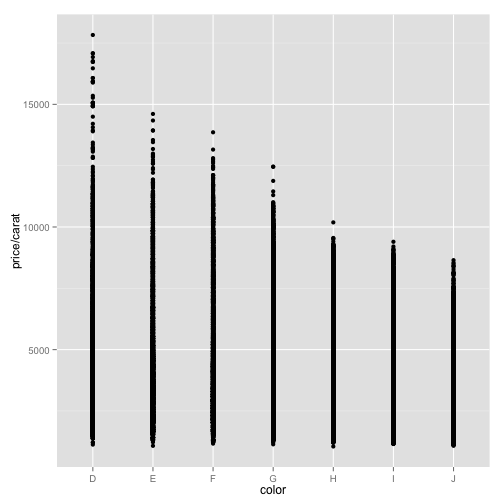
This could suggest a strong relationship but maybe not. It depends on the center of the distributions for each color.
ppc + geom_jitter()
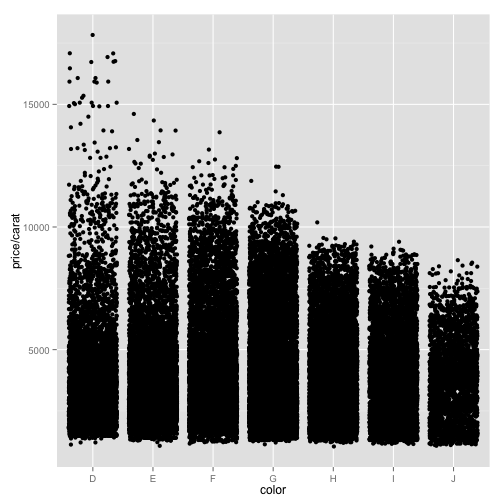
Jittering moves points a little to reduce overplotting. This makes it look the centers are closer to being equal.
Using alpha can further reduce the effect of overplotting.
ppc + geom_jitter(alpha = 0.1)
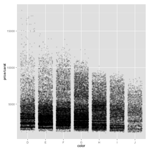
This is more informative, still. Jittering is a common way to reduce overplotting. It can also appear as an option within other geoms that plot points of lines.
Of course, a common way of plotting contionuous ~ discrete is a boxplot.
ppc + geom_boxplot()
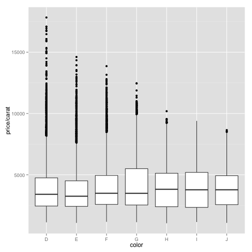
This makes it clear that the medians per color for price/carat are about the same, and certainly not statistically different.
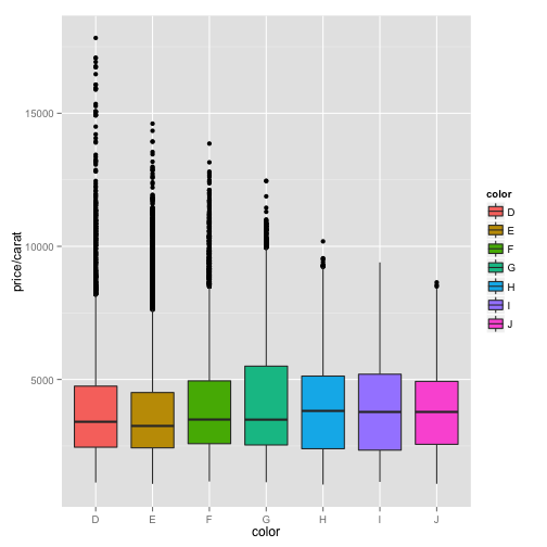
You can decorate the boxes using a fill, which is another aesthetic.
ppc + geom_boxplot(aes(fill = color))
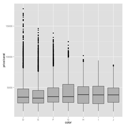
# or fill all as gray
ppc + geom_boxplot(fill = "gray")
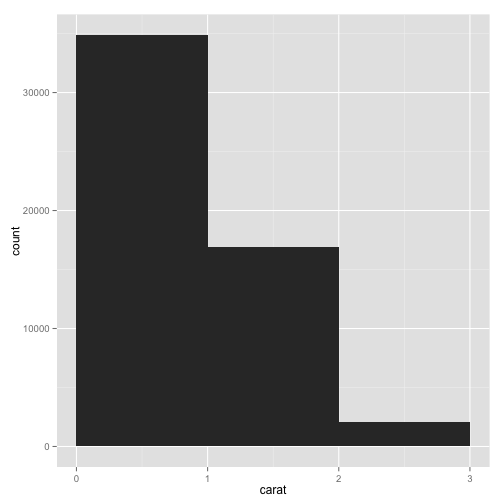
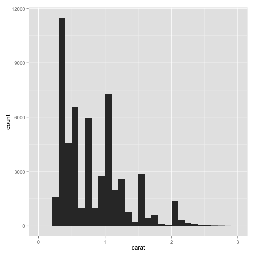
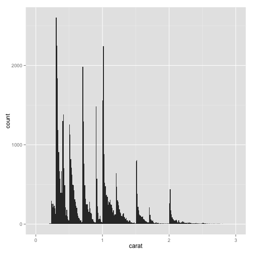
The most basic plot of a distribution is a histogram. When plotting histograms it is important to experiment with varied bin widths top see what is the distribution at different levels of detail.
Study the distribution of the carat variable.
summary(diamonds$carat)
##    Min. 1st Qu.  Median    Mean 3rd Qu.    Max.
##   0.200   0.400   0.700   0.798   1.040   5.010
pcarat <- ggplot(data = diamonds, aes(x = carat))
pcarat + geom_histogram()
## stat_bin: binwidth defaulted to range/30. Use 'binwidth = x' to adjust
## this.
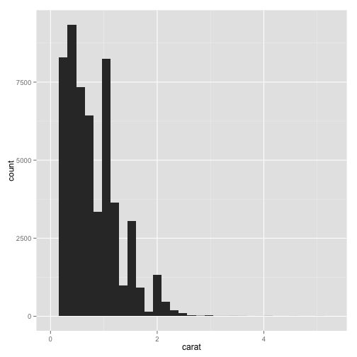
Outliers in the data are skewing the picture of the majority. We need to restrict the scale of carat in the data, or the region we're plotting.
pcarat + geom_histogram() + scale_x_continuous(limits = c(0, 3))
## stat_bin: binwidth defaulted to range/30. Use 'binwidth = x' to adjust
## this.

Now that that's fixed, let's experiment with bin widths.
pcarat + geom_histogram(binwidth = 1) + scale_x_continuous(limits = c(0, 3))
pcarat + geom_histogram(binwidth = 0.1) + scale_x_continuous(limits = c(0, 3))
pcarat + geom_histogram(binwidth = 0.01) + scale_x_continuous(limits = c(0,
    3))
## Warning: position_stack requires constant width: output may be incorrect
Density plots give a continuous estimate to the distribution.
pcarat + geom_density() + scale_x_continuous(limits = c(0, 3))
## Warning: Removed 32 rows containing non-finite values (stat_density).
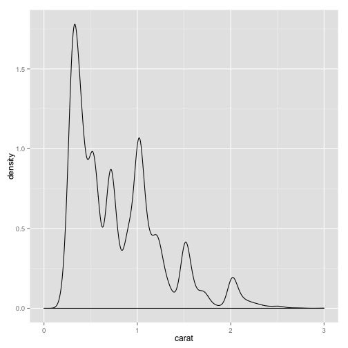
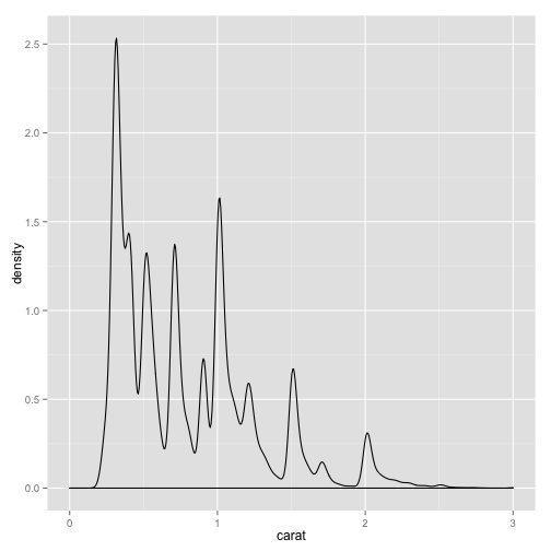
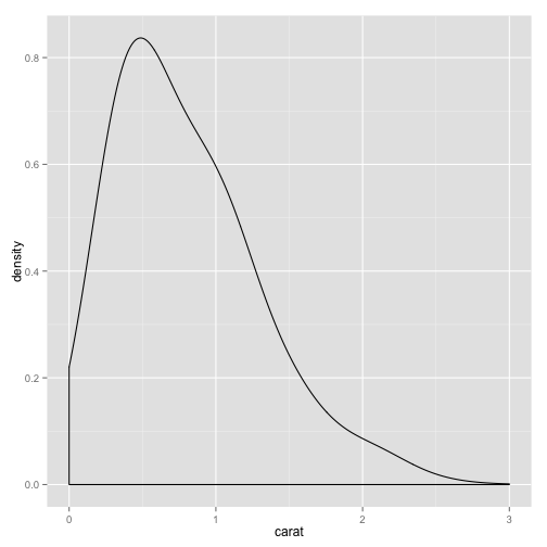
The stat_density function created the plotted data. Parameters that effect how the density estimate is calculated are passed through the geom function.
# bumpier
pcarat + geom_density(adjust = 0.5) + scale_x_continuous(limits = c(0, 3))
## Warning: Removed 32 rows containing non-finite values (stat_density).
# smoother
pcarat + geom_density(adjust = 5) + scale_x_continuous(limits = c(0, 3))
## Warning: Removed 32 rows containing non-finite values (stat_density).
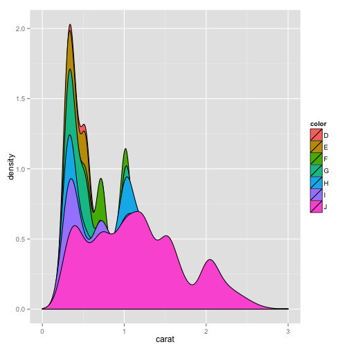
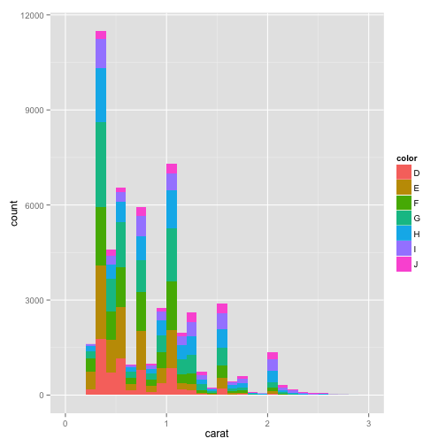
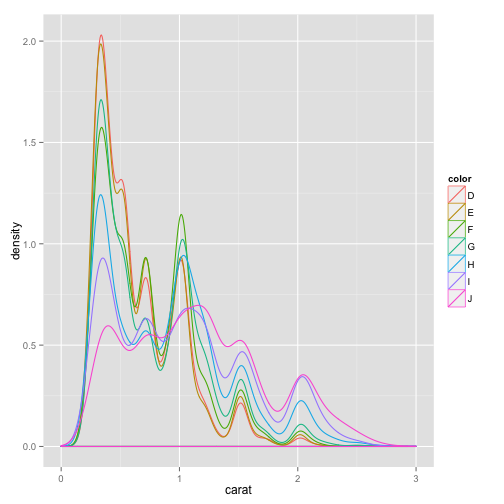
If you also map an aesthetic to a discrete variable, like color or fill, it splits the data on this variable and plots them overlaid or stacked.
pcarat + geom_histogram(binwidth = 0.1, aes(fill = color)) + scale_x_continuous(limits = c(0,
    3))
# Here color is the variable from the dataset
pcarat + geom_histogram(binwidth = 0.1, aes(color = color)) + scale_x_continuous(limits = c(0,
    3))

# here, color is an aesthetic and the variable in the data This just
# colored the border and left the fill as black
pcarat + geom_density(aes(color = color)) + scale_x_continuous(limits = c(0,
    3))
## Warning: Removed 1 rows containing non-finite values (stat_density).
## Warning: Removed 1 rows containing non-finite values (stat_density).
## Warning: Removed 1 rows containing non-finite values (stat_density).
## Warning: Removed 1 rows containing non-finite values (stat_density).
## Warning: Removed 6 rows containing non-finite values (stat_density).
## Warning: Removed 13 rows containing non-finite values (stat_density).
## Warning: Removed 9 rows containing non-finite values (stat_density).
pcarat + geom_density(aes(fill = color)) + scale_x_continuous(limits = c(0,
    3))
## Warning: Removed 1 rows containing non-finite values (stat_density).
## Warning: Removed 1 rows containing non-finite values (stat_density).
## Warning: Removed 1 rows containing non-finite values (stat_density).
## Warning: Removed 1 rows containing non-finite values (stat_density).
## Warning: Removed 6 rows containing non-finite values (stat_density).
## Warning: Removed 13 rows containing non-finite values (stat_density).
## Warning: Removed 9 rows containing non-finite values (stat_density).
