Our examples so far have largely focused on the mandatory features of a plot: data, aesthetic mapping and geom. These control what is being plotted and the relationship between data and what you see. This lecture describes the main ways you'll control the visual details of the elements you plot. recall
scales map values in the data space to values in the aesthetic space (color, size, shape ...). Scales are reported on the plot using axes and legends.
Scales do have a big effect on the visual appearance of the plot, but the dominant way to declare precisely how you want parts of the plot to look is with arguments to the theme command. It will take experience to know when you change the scale and when the theme. Rule of thumb: themes don't add words and change ranges of variables; they change the font, size, color, etc.
setwd("~/Documents/Computing with Data/12_Scales_and_themes/")
library(ggplot2)
str(movies)
## 'data.frame':    58788 obs. of  24 variables:
##  $ title      : chr  "$" "$1000 a Touchdown" "$21 a Day Once a Month" "$40,000" ...
##  $ year       : int  1971 1939 1941 1996 1975 2000 2002 2002 1987 1917 ...
##  $ length     : int  121 71 7 70 71 91 93 25 97 61 ...
##  $ budget     : int  NA NA NA NA NA NA NA NA NA NA ...
##  $ rating     : num  6.4 6 8.2 8.2 3.4 4.3 5.3 6.7 6.6 6 ...
##  $ votes      : int  348 20 5 6 17 45 200 24 18 51 ...
##  $ r1         : num  4.5 0 0 14.5 24.5 4.5 4.5 4.5 4.5 4.5 ...
##  $ r2         : num  4.5 14.5 0 0 4.5 4.5 0 4.5 4.5 0 ...
##  $ r3         : num  4.5 4.5 0 0 0 4.5 4.5 4.5 4.5 4.5 ...
##  $ r4         : num  4.5 24.5 0 0 14.5 14.5 4.5 4.5 0 4.5 ...
##  $ r5         : num  14.5 14.5 0 0 14.5 14.5 24.5 4.5 0 4.5 ...
##  $ r6         : num  24.5 14.5 24.5 0 4.5 14.5 24.5 14.5 0 44.5 ...
##  $ r7         : num  24.5 14.5 0 0 0 4.5 14.5 14.5 34.5 14.5 ...
##  $ r8         : num  14.5 4.5 44.5 0 0 4.5 4.5 14.5 14.5 4.5 ...
##  $ r9         : num  4.5 4.5 24.5 34.5 0 14.5 4.5 4.5 4.5 4.5 ...
##  $ r10        : num  4.5 14.5 24.5 45.5 24.5 14.5 14.5 14.5 24.5 4.5 ...
##  $ mpaa       : Factor w/ 5 levels "","NC-17","PG",..: 1 1 1 1 1 1 5 1 1 1 ...
##  $ Action     : int  0 0 0 0 0 0 1 0 0 0 ...
##  $ Animation  : int  0 0 1 0 0 0 0 0 0 0 ...
##  $ Comedy     : int  1 1 0 1 0 0 0 0 0 0 ...
##  $ Drama      : int  1 0 0 0 0 1 1 0 1 0 ...
##  $ Documentary: int  0 0 0 0 0 0 0 1 0 0 ...
##  $ Romance    : int  0 0 0 0 0 0 0 0 0 0 ...
##  $ Short      : int  0 0 1 0 0 0 0 1 0 0 ...
The most basic aesthetics are the mappings to x and y axes.
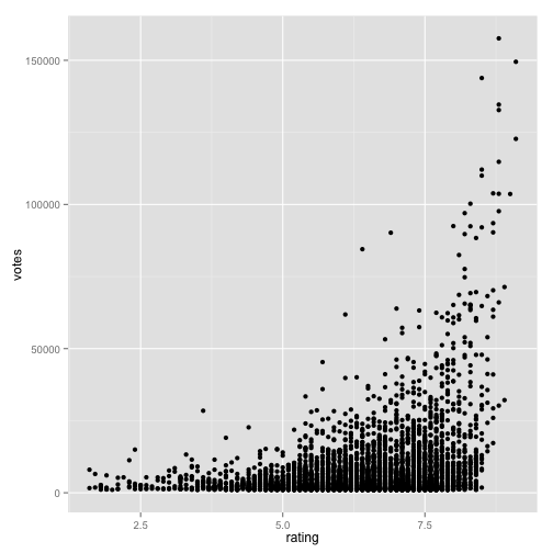
To begin, here is a plot of votes versus ratings of movies that got at least 1000 votes.
(m <- ggplot(data = subset(movies, votes > 1000), aes(x = rating, y = votes)) +
    geom_point())

Control of the x and y axes for continuous variables is done with the functions scale_x_continuous and scale_y_continuous. These functions are used to set the following arguments:
name, breaks, labels, limits, na.value, trans.
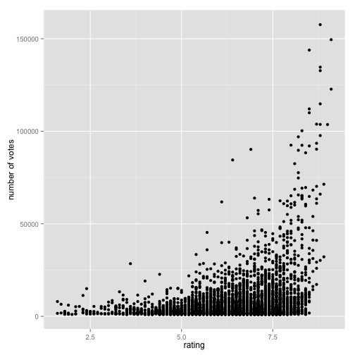
Set the y axis label:
m + scale_y_continuous(name = "number of votes")
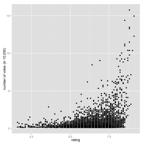
Let's relabel the axes to be in 10,000 votes.
m + scale_y_continuous(name = "number of votes (in 10,000)", labels = c(0, 5,
    10, 15))
We can also restrict the graph to a particular range of variables.
m + scale_y_continuous(name = "number of votes", limits = c(50000, 1e+05))
## Warning: Removed 4456 rows containing missing values (geom_point).
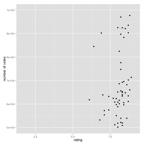
The defaults changed the picture a lot. Notice that data was the same so the x axis left room for many more points, although they are off screen now.
Because it comes up so often there are aliases for naming the axis scales.
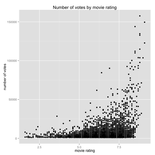
m + xlab("movie rating") + ylab("number of votes") + ggtitle("Number of votes by movie rating")

Or
m + labs(x = "movie rating", y = "number of votes", title = "Number of votes by movie rating")
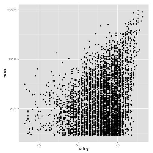
We can use the trans argument to transform the axis to, e.g., a log scale.
m + scale_y_continuous(trans = "log")
When plotting boxplots, for example, one variable is discrete. The possible arguments for scale_x_discrete are
name, breaks, labels, limits, na.value, guide.
d <- ggplot(data = diamonds, aes(x = cut)) + geom_bar()
d
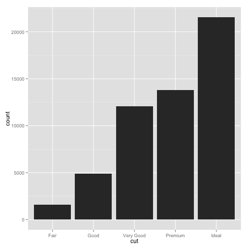
In the scale the breaks are the actual values of the cut variable. I can set the labels to abbreviations.
d + scale_x_discrete(labels = c("F", "G", "VG", "P", "I"))

We can decorate geoms with the color aesthetic mapped from either a discrete or continous variable.
dsamp <- diamonds[sample(nrow(diamonds), 1000), ]
(dd <- ggplot(data = dsamp, aes(x = carat, y = price, color = clarity)) + geom_point())
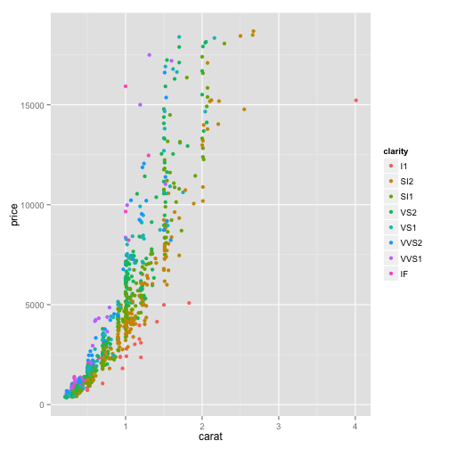
Here, we have x and y axes for carat and price. We also have a legend that specifies the mapping from clarity to colors. The colors are chosen by default using evenly spaced hue values. We can use scale_color_discrete or equivalently scale_color_hue to change legend name or labels, limits, and the hue values used. parameters you can set are h = range of hues in [0, 360], c = chroma (intensity of color), l = luminance (lightness) in [0, 100]; ands some others you can play with.
dd + scale_color_hue(l = 80, c = 200)
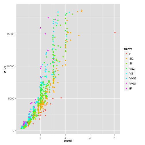
dd + scale_color_hue(l = 20, c = 200)
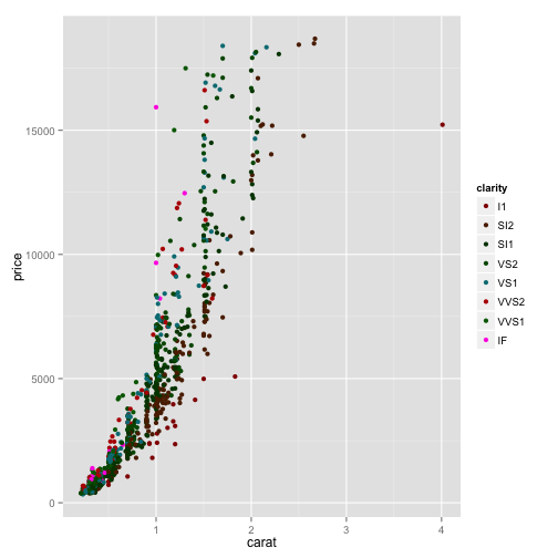
dd + scale_color_hue(l = 80, c = 50)
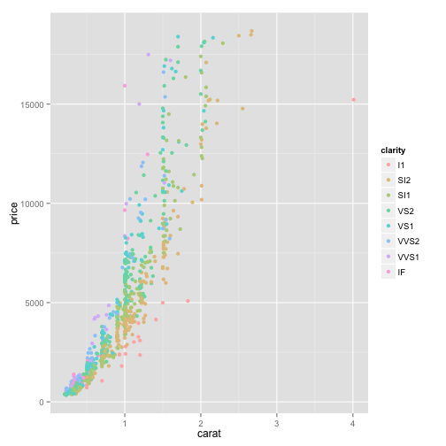
dd + scale_color_hue(h = c(200, 250))
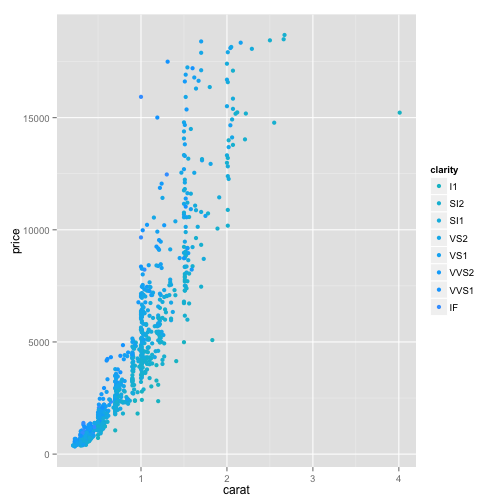
Instead of hue we can use other set color palettes (color brewer, e.g.) or use a gray scale.
dd + scale_color_grey()
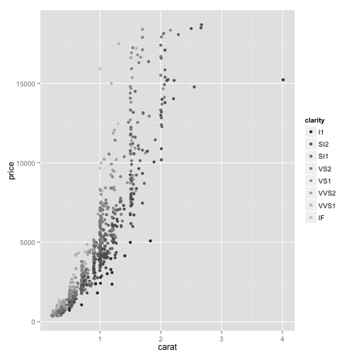
dd + scale_color_brewer()
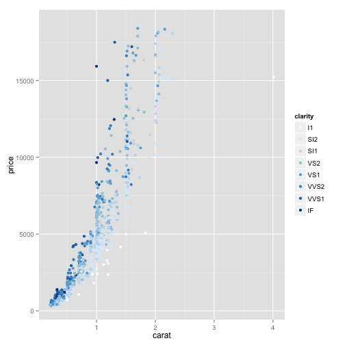
We can map a continuous variable to a color gradient, specifying the low and high limits of the gradient and whether to use a colourbar or legend as the guide.
str(dsamp)
## 'data.frame':    1000 obs. of  10 variables:
##  $ carat  : num  1.05 0.32 2 0.3 0.43 0.74 0.41 1.54 0.31 0.31 ...
##  $ cut    : Ord.factor w/ 5 levels "Fair"<"Good"<..: 5 3 3 5 4 5 5 5 4 4 ...
##  $ color  : Ord.factor w/ 7 levels "D"<"E"<"F"<"G"<..: 6 5 6 6 1 1 4 3 2 3 ...
##  $ clarity: Ord.factor w/ 8 levels "I1"<"SI2"<"SI1"<..: 4 4 4 4 3 4 6 4 2 4 ...
##  $ depth  : num  60.2 63 59.5 62.7 60.1 61.9 60.9 61.8 60.9 59.7 ...
##  $ table  : num  57 57 62 54 58 56 56 56 60 60 ...
##  $ price  : int  5347 505 15510 438 830 3087 960 17240 435 802 ...
##  $ x      : num  6.6 4.35 8.13 4.28 4.89 5.84 4.81 7.36 4.35 4.42 ...
##  $ y      : num  6.65 4.38 8.21 4.3 4.93 5.79 4.84 7.39 4.38 4.39 ...
##  $ z      : num  3.99 2.75 4.86 2.69 2.95 3.6 2.94 4.56 2.66 2.63 ...
(e <- ggplot(data = dsamp, aes(x = x, y = y, color = price)) + geom_point())
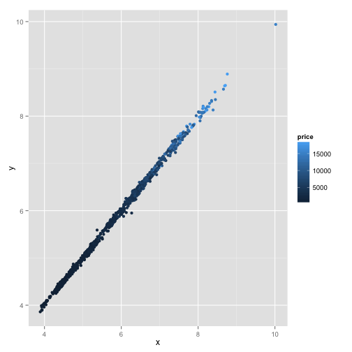
There are scales for shape, size, fill, ... There are similarities in how legend names and such are set. exactly which shapes, e.g., are associated with which variable values can be customized by more particular variables. The online documentation and examples will be needed to learn the codes for the values if you don't want the defaults.
Themes are how you control the visual details of what you plot. It is infinitely flexible if you can find the right parameter.
dd

dd + theme(legend.position = "bottom")
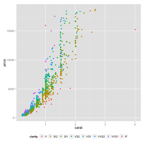
dd + theme(legend.position = c(0.8, 0.8)) # centered here where x, y in (0, 1)
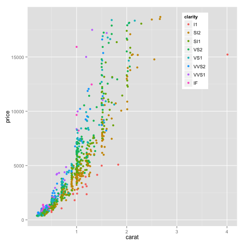
dd + theme(legend.position = c(0.85, 0.5))
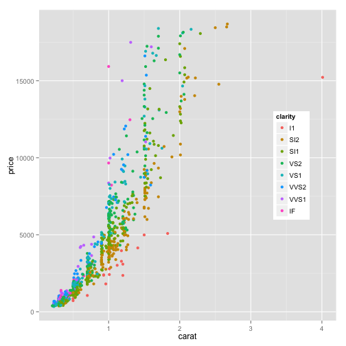
dd + theme(legend.position = c(0.85, 0.4))
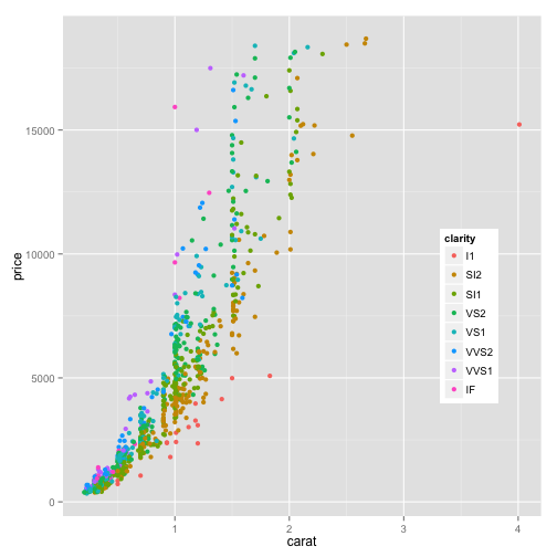
You can make the boxes smaller and change their fill.
library(gridExtra)
## Loading required package: grid
dd + theme(legend.key.size = unit(1, "mm"))
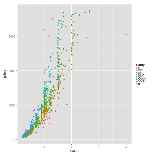
dd + theme(legend.key.size = unit(5, "mm"))

I don't like the gray bckground to the legend keys.
dd + theme(legend.key.size = unit(5, "mm"), legend.key = element_rect(fill = "white"))
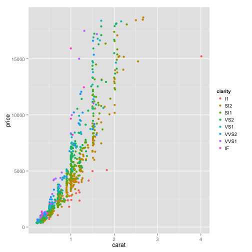
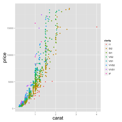
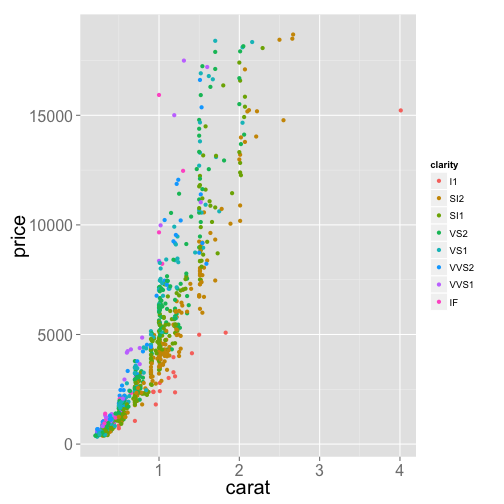
When preparing figures for publication, changing the size of text can be very important.
dd + theme(axis.title.x = element_text(size = 20), axis.title.y = element_text(size = 20))
dd + theme(axis.title.x = element_text(size = 20), axis.title.y = element_text(size = 20),
    axis.text = element_text(size = 16))
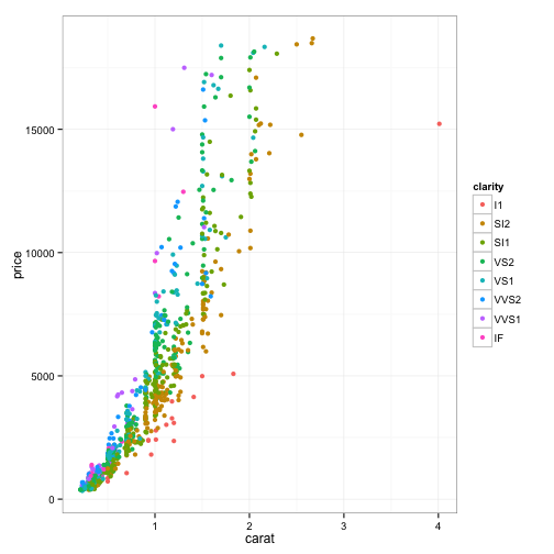
There are ways to reset a lot of theme elements all at once. Just define a new function that sets new default values. One that's provided with ggplot is theme_bw().
dd + theme_bw()
It's common in published figure plots to include on the plot some text describing the significance of a statistic, some extra explanation of some element plotted there or a label of which panel in a multipanel figure. The command annotate can be used.
dd + annotate("text", x = 2.7, y = 4000, label = "p = 1")

The plotmath set of expressions can be used to add LaTeX-like formulas. There is special formating needed to insert via annotate.
dd + annotate("text", x = 2.7, y = 4000, label = "p == 2.3 %*% 10^{-3}", parse = T)

The option parse tells annotate to evaluate the character string rather than reproducing it literally.
Note that when you want to use LaTeX-like formulas in axis labels, plotmath expressions are the same but you make them appear differently.
dd + xlab(expression(carat^alpha))
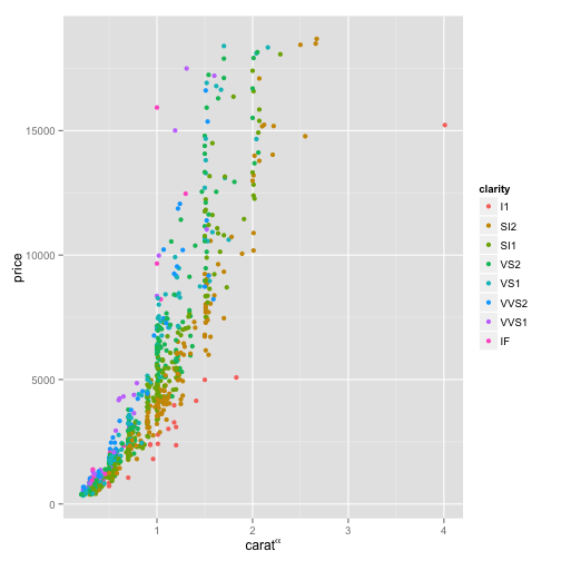
That is, treat caratalpha as an expression to be evaluated instead of a character string.
These plots on the screen aren't very useful if they stay in here. ggplot2 provides a function to export these to a pdf file of a specified size on disk.
ggsave(filename = "dd.pdf", plot = dd, width = 6, height = 7)