In some circumstances we want to plot relationships between set variables in multiple subsets of the data with the results appearing as panels in a larger figure. This is a known as a facet plot. This is a very useful feature of ggplot2. The faceting is defined by a categorical variable or variables. Each panel plot corresponds to a set value of the variable.
setwd("~/Documents/Computing with Data/13_Facets/")
library(ggplot2)
Here, a single categorical variable defines subsets of the data. The panels are calculated in a 1 dimensional ribbon that can be wrapped to multiple rows.
str(mpg)
## 'data.frame':    234 obs. of  11 variables:
##  $ manufacturer: Factor w/ 15 levels "audi","chevrolet",..: 1 1 1 1 1 1 1 1 1 1 ...
##  $ model       : Factor w/ 38 levels "4runner 4wd",..: 2 2 2 2 2 2 2 3 3 3 ...
##  $ displ       : num  1.8 1.8 2 2 2.8 2.8 3.1 1.8 1.8 2 ...
##  $ year        : int  1999 1999 2008 2008 1999 1999 2008 1999 1999 2008 ...
##  $ cyl         : int  4 4 4 4 6 6 6 4 4 4 ...
##  $ trans       : Factor w/ 10 levels "auto(av)","auto(l3)",..: 4 9 10 1 4 9 1 9 4 10 ...
##  $ drv         : Factor w/ 3 levels "4","f","r": 2 2 2 2 2 2 2 1 1 1 ...
##  $ cty         : int  18 21 20 21 16 18 18 18 16 20 ...
##  $ hwy         : int  29 29 31 30 26 26 27 26 25 28 ...
##  $ fl          : Factor w/ 5 levels "c","d","e","p",..: 4 4 4 4 4 4 4 4 4 4 ...
##  $ class       : Factor w/ 7 levels "2seater","compact",..: 2 2 2 2 2 2 2 2 2 2 ...
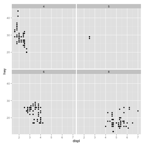
p <- ggplot(data = mpg, aes(x = displ, y = hwy)) + geom_point()
p + facet_wrap(~cyl)
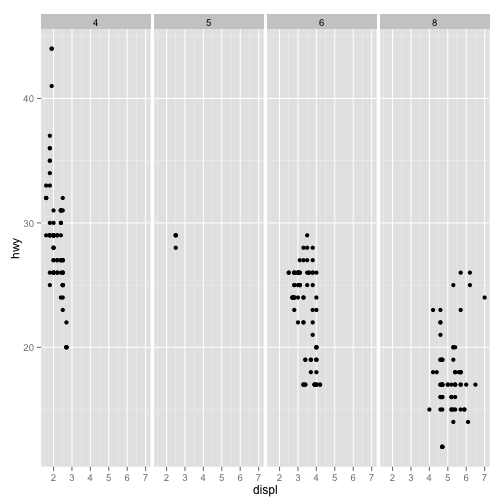
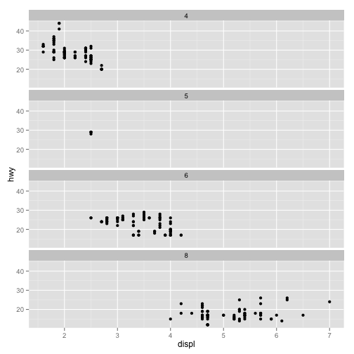
We can control the layout with options to the facet_wrap function.
p + facet_wrap(~cyl, nrow = 1)
p + facet_wrap(~cyl, ncol = 1)
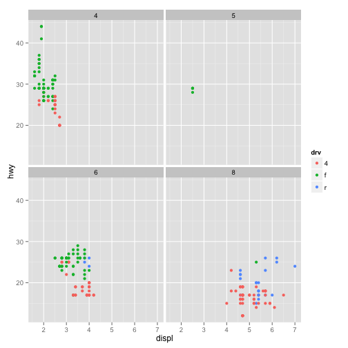
We can add an aesthetic for another variable and get one legend.
p <- ggplot(data = mpg, aes(x = displ, y = hwy, color = drv)) + geom_point()
p + facet_wrap(~cyl)
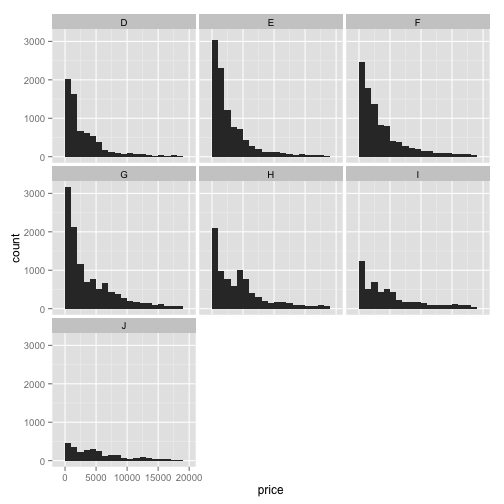
Some of the subsets may exhibit extreme bahavior of a variable causing other facets to plot in uncommunicative ways.
p <- ggplot(data = diamonds, aes(x = price)) + geom_histogram(binwidth = 1000)
p + facet_wrap(~color)
We can get a better plot by letting the y axes vary freely.
p + facet_wrap(~color, scales = "free_y")
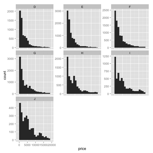
Visually, it looks like the histograms are about the same and they aren't in actual counts. The relative sizes between the bins are not so different, though.
Other scales options are "free_x" and "free_xy"
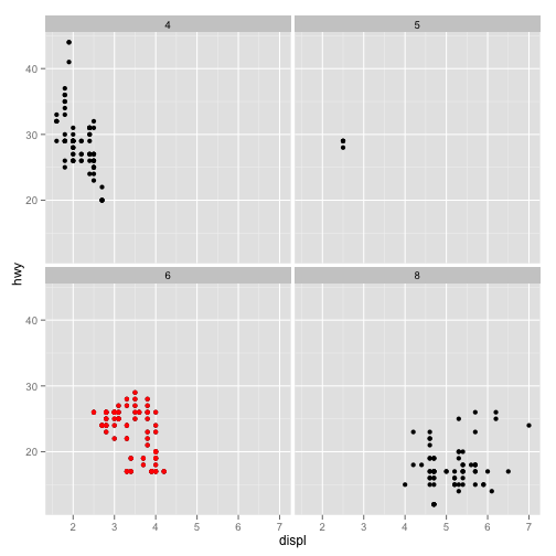
Sometimes we may want to add features to a single facet. To do that we need to restrict the data.
p <- ggplot(data = mpg, aes(x = displ, y = hwy)) + geom_point()
q <- p + facet_wrap(~cyl)
cycl6 <- subset(mpg, cyl == 6)
q + geom_point(data = cycl6, color = "red")
## Warning: invalid factor level, NAs generated
Here, the panels are determined by the values of multiple variables.
str(mtcars)
## 'data.frame':    32 obs. of  11 variables:
##  $ mpg : num  21 21 22.8 21.4 18.7 18.1 14.3 24.4 22.8 19.2 ...
##  $ cyl : num  6 6 4 6 8 6 8 4 4 6 ...
##  $ disp: num  160 160 108 258 360 ...
##  $ hp  : num  110 110 93 110 175 105 245 62 95 123 ...
##  $ drat: num  3.9 3.9 3.85 3.08 3.15 2.76 3.21 3.69 3.92 3.92 ...
##  $ wt  : num  2.62 2.88 2.32 3.21 3.44 ...
##  $ qsec: num  16.5 17 18.6 19.4 17 ...
##  $ vs  : num  0 0 1 1 0 1 0 1 1 1 ...
##  $ am  : num  1 1 1 0 0 0 0 0 0 0 ...
##  $ gear: num  4 4 4 3 3 3 3 4 4 4 ...
##  $ carb: num  4 4 1 1 2 1 4 2 2 4 ...
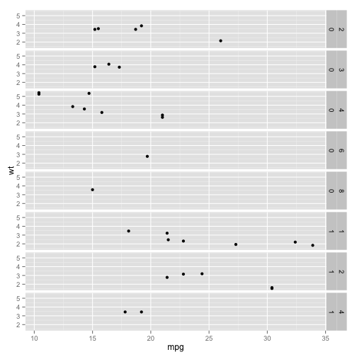
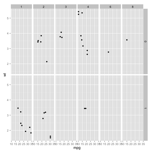
Plot weight versus mpg for each value of vs and carb.
p <- ggplot(data = mtcars, aes(mpg, wt)) + geom_point()
p + facet_grid(vs ~ carb)
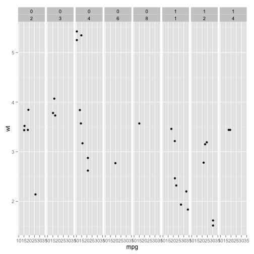
You can also have panels displayed in a other geometries, although they are defined with multiple variables.
p + facet_grid(. ~ vs + carb)
p + facet_grid(vs + carb ~ .)