Here we illustrate markdown, knitr, ggplot2, and some other packages to motivate what's to come. We'll use a dataset on 10000 measurements of height and weight for men and women available through the book Machine Learning for Hackers, Drew Conway & John Myles-While, O'Reilly Media.
We begin by loading packages.
setwd("~/Documents/Computing with Data/2_Motivation/")
library(ggplot2)
library(reshape2)
library(plyr)
First load the data.
ht_weight_df <- read.csv(file = "../Data/01_heights_weights_genders.txt")
# str is short for structure(). It reports what's in the data.frame
str(ht_weight_df)
## 'data.frame':    10000 obs. of  3 variables:
##  $ Gender: Factor w/ 2 levels "Female","Male": 2 2 2 2 2 2 2 2 2 2 ...
##  $ Height: num  73.8 68.8 74.1 71.7 69.9 ...
##  $ Weight: num  242 162 213 220 206 ...
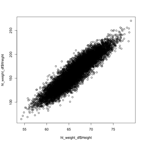
We certainly expect dependence between height and weight. Let's plot the points on a plane and see what it looks like.
plot(x = ht_weight_df$Height, y = ht_weight_df$Weight)
It really does look like there is a strong linear relationship. Execute an lm fit to see.
lm_ht_weight <- lm(Weight ~ Height, data = ht_weight_df)
summary(lm_ht_weight)
##
## Call:
## lm(formula = Weight ~ Height, data = ht_weight_df)
##
## Residuals:
##    Min     1Q Median     3Q    Max
## -51.93  -8.24  -0.12   8.26  46.84
##
## Coefficients:
##              Estimate Std. Error t value Pr(>|t|)
## (Intercept) -350.7372     2.1115    -166   <2e-16 ***
## Height         7.7173     0.0318     243   <2e-16 ***
## ---
## Signif. codes:  0 '***' 0.001 '**' 0.01 '*' 0.05 '.' 0.1 ' ' 1
##
## Residual standard error: 12.2 on 9998 degrees of freedom
## Multiple R-squared: 0.855,   Adjusted R-squared: 0.855
## F-statistic: 5.9e+04 on 1 and 9998 DF,  p-value: <2e-16
There is an extremely strong linear relationship.
We expect that they do. Inspect the quantiles of height after restricting to each gender.
# Subset the full data.frame by genders
male_df <- subset(ht_weight_df, Gender == "Male")
female_df <- subset(ht_weight_df, Gender == "Female")
# Get the summary values of height
summary(male_df$Height)
##    Min. 1st Qu.  Median    Mean 3rd Qu.    Max.
##    58.4    67.2    69.0    69.0    71.0    79.0
summary(female_df$Height)
##    Min. 1st Qu.  Median    Mean 3rd Qu.    Max.
##    54.3    61.9    63.7    63.7    65.6    73.4
We'll be learning how to use the plyr package to split data.frames or arrays or lists into sub-objects, apply functions to all the results en masse and combine the outputs in a neat form. The above can be done with plyr as follows.
ddply(ht_weight_df, .(Gender), function(df) summary(df$Height))
##   Gender Min. 1st Qu. Median Mean 3rd Qu. Max.
## 1 Female 54.3    61.9   63.7 63.7    65.6 73.4
## 2   Male 58.4    67.2   69.0 69.0    71.0 79.0
In this case, there isn't a big savings in effort, but as the number of levels increases, it can be a real timesaver. This just scratches the surface of using plyr.
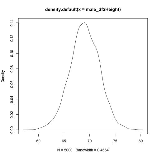
We see that the means and other order statistics are shifted. Are the entire distributions shifted, or is there some skewing by geneder?
plot(density(male_df$Height))
plot(density(female_df$Height))
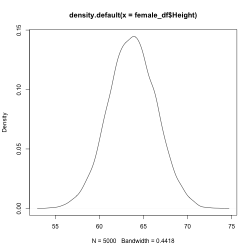
For men there is a little bump around 6 feet. (Maybe the measurers generously rounded up the guys who are 5'11.5".) However the distributions look pretty close. It would be best if we could overlay the plots.
The package ggplot2 has had a significant impact on visualization in statistics. It will change the way you work.
dens_by_gender <- ggplot(data = ht_weight_df, aes(x = Height, color = Gender)) +
    geom_density()
dens_by_gender
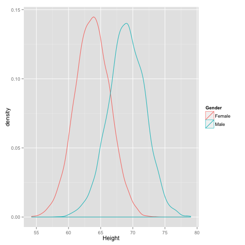
This makes it more clear. It looks like these are two normal distributions with different means. We can check a Q-Q plot.
qq_by_gender <- ggplot(data = ht_weight_df, aes(sample = Height)) + geom_point(stat = "qq") +
    facet_wrap(~Gender)
qq_by_gender
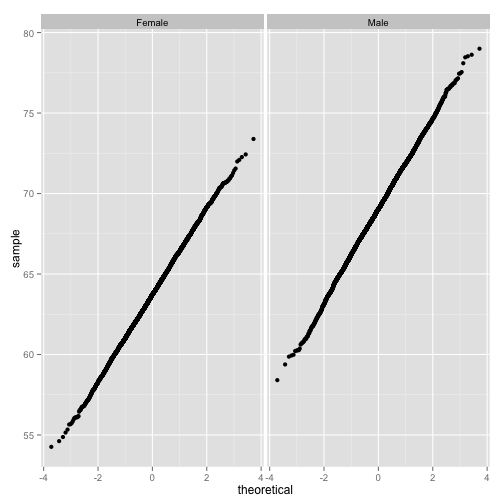
Yes, these are normal.
We saw earlier that there is a good linear fit of weight versus height, but the distributions of these vary by gender. It's natural to ask if there is a significant difference between the linear fits. First plot the points colored by gender.
ht_wt_pt_gender <- ggplot(data = ht_weight_df, aes(x = Height, y = Weight, color = Gender)) +
    geom_point(alpha = 0.2)
ht_wt_pt_gender
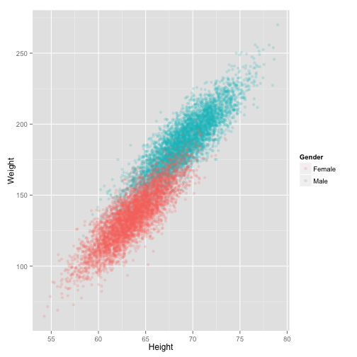
It looks like the lines should have the same slope. Let's turn back to statistics and compute the fits with a factor for gender.
lm_ht_wt_by_gender <- lm(Weight ~ Height * Gender, data = ht_weight_df)
summary(lm_ht_wt_by_gender)
##
## Call:
## lm(formula = Weight ~ Height * Gender, data = ht_weight_df)
##
## Residuals:
##    Min     1Q Median     3Q    Max
## -44.19  -6.80  -0.12   6.81  35.81
##
## Coefficients:
##                    Estimate Std. Error t value Pr(>|t|)
## (Intercept)       -246.0133     3.3497  -73.44   <2e-16 ***
## Height               5.9940     0.0525  114.10   <2e-16 ***
## GenderMale          21.5144     4.7853    4.50    7e-06 ***
## Height:GenderMale   -0.0323     0.0722   -0.45     0.65
## ---
## Signif. codes:  0 '***' 0.001 '**' 0.01 '*' 0.05 '.' 0.1 ' ' 1
##
## Residual standard error: 10 on 9996 degrees of freedom
## Multiple R-squared: 0.903,   Adjusted R-squared: 0.903
## F-statistic: 3.09e+04 on 3 and 9996 DF,  p-value: <2e-16
So, the intercepts are statistically different but the slopes are not.