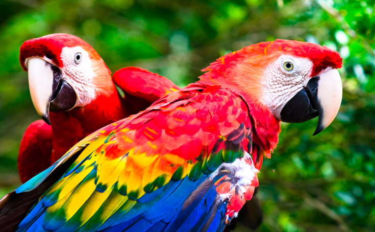
Parrots
Nearly a third of the world's parrot species faces threat of extinction. Of all birds, parrots have the most number of endangered species.

Honeybees
Although not officially endangered, American honeybees have “declined by 89% in relative abundance and continues to decline toward extinction.”

Red Pandas
The Red Pandas habitat is shrinking everyday as a result of housing and commercial expansion.
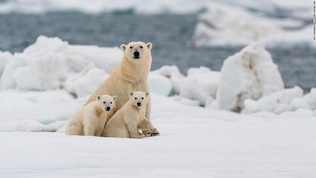
Polar Bears
With global temperatures rising and the melting of the polar ice cap poses a grave threat to the Polar Bears.