A look into how the twitters of AOC, Obama, and Trump differ
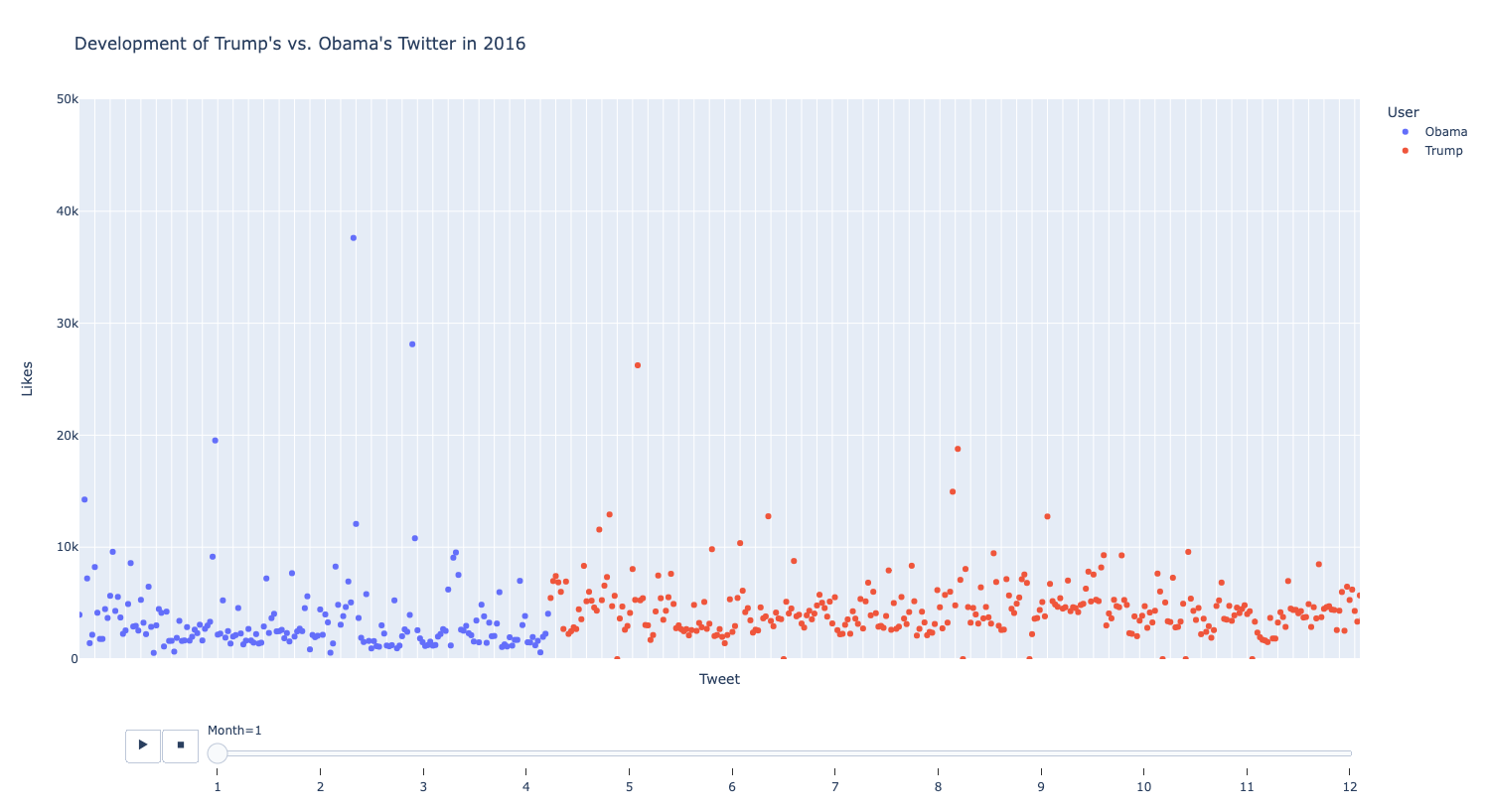
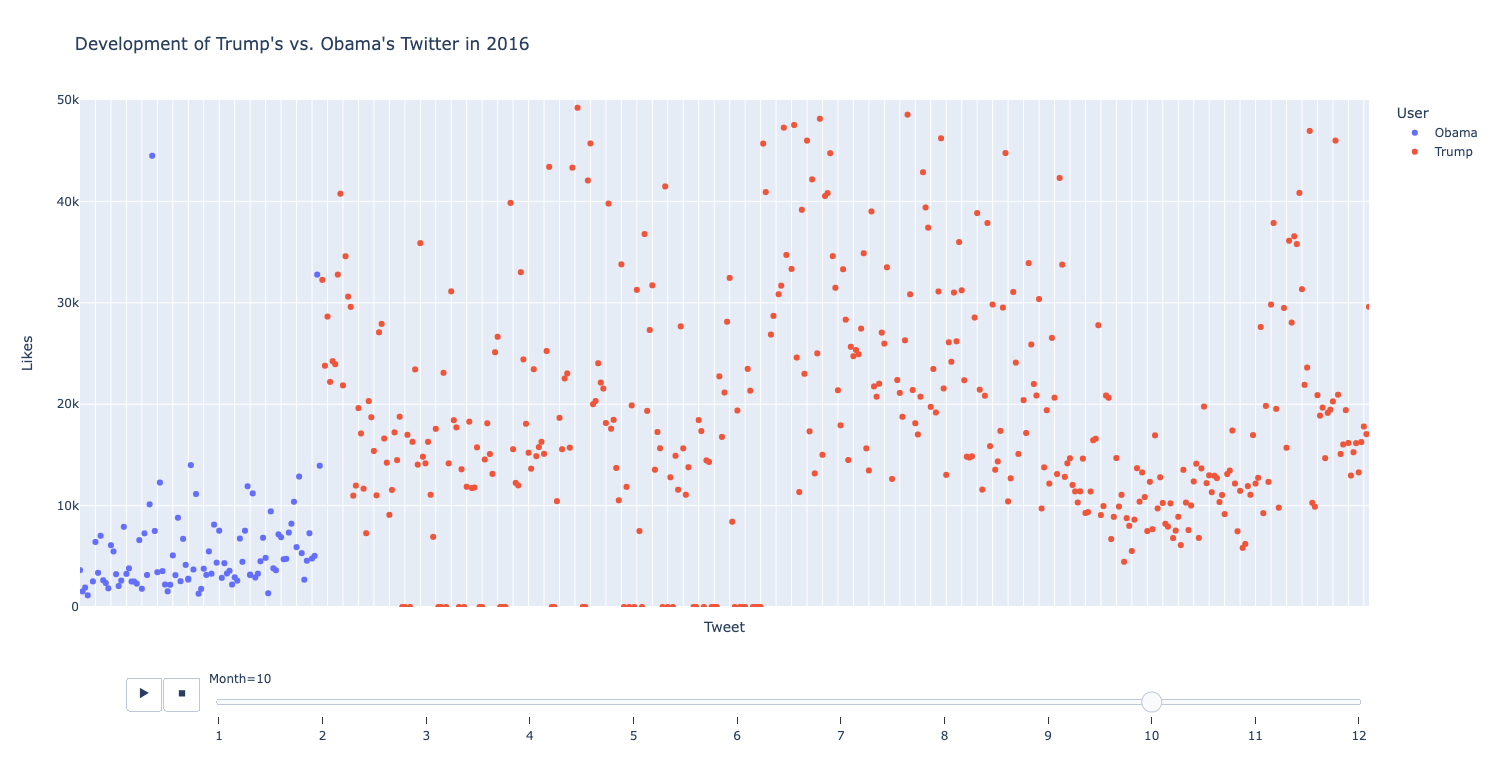
Graph 1: Account Improvement Comparison
January 2016
October 2016
This scatter plot graph analyzes both Obama and Trump’s monthly tweet success in the year 2016. The graph portrays the success of every tweet by each politician throughout the months of 2016. For this graph, each number corresponds to its month (1 - Jan, 2 - Feb, etc.). In January of 2016, both accounts has similar success, averaging around 5k - 10k likes per tweet. But, Trump’s account improved much more over the span of 2016. By October, many of his tweets were averaging more than 25k likes, while Obama’s stayed in the 5k-10k range.
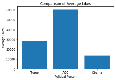
For the bar graph on the left, we compared the average likes between Trump, AOC, and Obama. AOC receives the most likes on her tweets at roughly 60,000 while Trump remains near 30,000 and Obama hovers at 15,000. But why? This is most likely because AOC is the youngest of the three. She is more in tune with young culture on Twitter and therefore knows how to use it better. Trump, on the other hand, may be older than Obama but Twitter was his main personality trait before getting banned. Obama is older and is not as in tune with social media culture and therefore pulls smaller numbers.
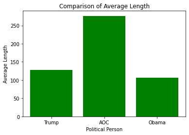
For the bar graph on the right, we decided to compare the average length of the tweet for Trump, AOC, and Obama. Shockingly, the graph resembles the average likes. AOC tends to have larger tweets and more successful tweets while Trump and Obama have medium sized tweets and less successful tweets. This is most fascinating when you consider the other graph. This is most likely because Trump and Obama would often tweet out a word or phrase as opposed to a long message like AOC.
Insight: Differing lengths work different for each canidate. No general trend.
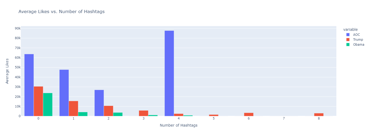
Graph 3: Comparing Hashtag Usage
This bar graph analyzes all three of the subject’s hashtag use and compares them with their average number of likes when using that number of hashtags. As seen in the graph, there is a general trend downward.
Insight: The more hashtags used, the fewer likes it receives.
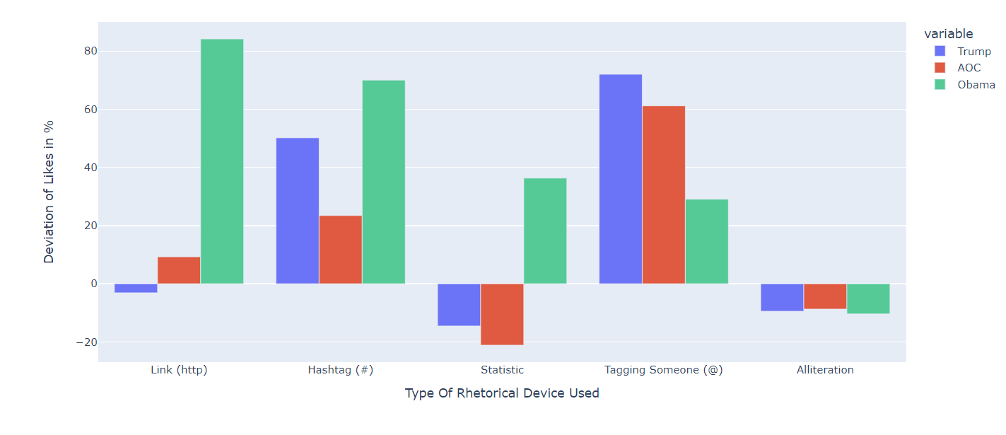
Graph 4: Variety of Rhetorical Comparisons
This bar graph analyzes five different rhetorical devices and measures the success of the tweets that use them across all three subjects. For this graph, we chose to analyze links, hashtags, stats, tags, and alliteration. Instead of measuring the average number of likes, we decided to measure the percent above or below the tweets performed when they use the particular rhetorical device. This is because it would be unfair to compare AOC’s abundance of likes with Obama’s fewer likes. Therefore, we can see the success not as a total, but as a rate. There are many different insights to gather from this graph. You can see that links, hashtags, stats, and tags are successful for Obama, but alliteration is not. You can also see that links, stats, and alliteration lowers Trump’s likes while hashtags and tags raise it. AOC is roughly the same as Trump in this regard.
Insight: Generally, Obama is the most efficient when using rhetorical strategies.